
Mastering Tailwind CSS: A Guide to Padding, Margin, and Borders
What is Tailwind and Why Tailwind?
Tailwind CSS is a utility-first CSS framework that provides low-level utility classes to build custom designs without writing CSS from scratch. Unlike traditional CSS frameworks like Bootstrap or Foundation, which provide predefined components, Tailwind gives you complete control over your design by offering utility classes for almost every CSS property. This approach can significantly speed up the development process and make the codebase more maintainable.
Using Tailwind CSS, you can apply styles directly in your HTML, which can help you keep your CSS file size small and your website fast. Tailwind is highly customizable, allowing you to create unique designs by tweaking its configuration file. Furthermore, it has excellent documentation, a large community, and regular updates, making it a reliable choice for modern web development.
The Box Model in CSS
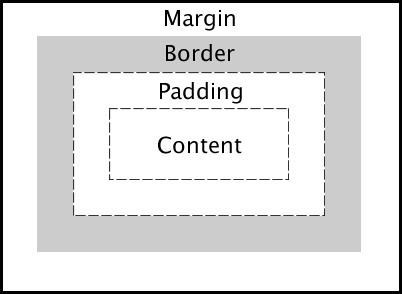
Before diving into Tailwind's padding, margin, and border utilities, let's briefly review the box model in CSS. The box model is a fundamental concept in CSS that describes how the elements on a web page are structured and displayed. The box model consists of four main components:
- Content: The innermost part where text and images appear.
- Padding: The space between the content and the border.
- Border: The line surrounding the padding and content.
- Margin: The outermost space that separates the element from other elements.
Understanding these components is crucial for creating well-structured layouts and designs in CSS.
Here is a visual representation of the box model:

What is Tailwind Padding?
Padding is the space between an element's content and its border. It helps to create breathing room inside an element, making the content more readable and visually appealing.
Tailwind Padding Classes
Tailwind CSS provides a variety of padding utility classes to add padding to an element. These classes are prefixed with p- followed by the size you want to apply. Here are some examples:
<div class="p-4">Padding 4</div>
<div class="pt-2">Padding Top 2</div>
<div class="pr-3">Padding Right 3</div>
<div class="pb-5">Padding Bottom 5</div>
<div class="pl-6">Padding Left 6</div>
<div class="px-8">Padding Horizontal 8</div>
<div class="py-10">Padding Vertical 10</div>
Here is a CodePen example demonstrating Tailwind padding classes. Feel free to experiment with different padding values to see how they affect the layout.
What is Tailwind Margin?
Margin is the space outside an element's border that separates it from other elements. It helps to create visual separation between elements and control the layout of a web page.
Tailwind Margin Classes
Tailwind CSS provides margin utility classes to add margin to an element. These classes are prefixed with m- followed by the size you want to apply. Here are some examples:
<div class="m-4">Margin 4</div>
<div class="mt-2">Margin Top 2</div>
<div class="mr-3">Margin Right 3</div>
<div class="mb-5">Margin Bottom 5</div>
<div class="ml-6">Margin Left 6</div>
<div class="mx-8">Margin Horizontal 8</div>
<div class="my-10">Margin Vertical 10</div>
Here is a CodePen example demonstrating Tailwind margin classes. Play around with different margin values to see how they affect the spacing between elements.
What is Tailwind Border?
A border is a line that surrounds an element's padding and content. It helps to visually separate elements and define their boundaries.
Tailwind Border Classes
Tailwind CSS provides border utility classes to add borders to an element. These classes are prefixed with border- followed by the size, style, and color you want to apply. Here are some examples:
<div class="border">Default Border</div>
<div class="border-2">Border 2</div>
<div class="border-4">Border 4</div>
<div class="border-t-2">Border Top 2</div>
<div class="border-r-4">Border Right 4</div>
<div class="border-b-2">Border Bottom 2</div>
<div class="border-l-4">Border Left 4</div>
<div class="border-dashed">Dashed Border</div>
<div class="border-dotted">Dotted Border</div>
<div class="border-double">Double Border</div>
<div class="border-solid">Solid Border</div>
Check out this CodePen example to see how different border styles look in practice.
Conditional Padding with Variants in Tailwind CSS
Tailwind CSS provides a powerful way to apply conditional styles using variants. This feature can be particularly useful when you want to adjust padding based on different states or screen sizes.
Responsive Padding
Tailwind allows you to apply different padding values based on screen size using responsive variants. For example:
<div class="p-4 md:p-6 lg:p-8">
  Responsive Padding Example
</div>
In this example:
p-4applies padding for smaller screens.md:p-6applies padding when the screen size is medium or larger.lg:p-8applies padding for large screens.
Conditional Padding with State Variants
You can also change padding based on different states like hover or focus:
<div class="p-4 hover:p-6 focus:p-8">
  Hover or Focus to Change Padding
</div>hover:p-6increases padding when the button is hovered over.focus:p-8increases padding when the button is focused.
Combining Variants
Tailwind CSS allows you to combine different variants to create complex conditional styles:
<div class="p-4 md:hover:p-6 lg:focus:p-8">
  Responsive and State-Based Padding
</div>
Here, padding changes not only based on screen size but also on user interactions like hover and focus.
Using Arbitrary Values
For more precise control, you can use arbitrary values for padding:
<div class="p-[10px] md:p-[15px] lg:p-[20px]">
  Arbitrary Padding Values
</div>
This approach is useful when you need specific pixel values that Tailwind's default scale doesn't cover.
Putting It All Together
Now that you understand Tailwind padding, margin, and border utilities, you can combine them to create well-structured layouts and designs in your web development projects. By leveraging Tailwind's utility-first approach, you can build custom designs quickly and efficiently without writing CSS from scratch.
Here is an example of how you can use Tailwind padding, margin, and border classes together:
<div class="m-4 p-4 border-2 border-gray-500">
    <h1 class="text-2xl mb-4">Tailwind CSS Example</h1>
    <p class="mb-2">This is a paragraph with some padding and margin.</p>
    <button class="bg-blue-500 text-white p-2 rounded">Click Me</button>
</div>
In this example, we have a div element with margin, padding, and a border. Inside the div, we have a heading, a paragraph, and a button styled with Tailwind classes. This demonstrates how you can use Tailwind's utility classes to create a well-structured layout with minimal CSS code.
Here is how the example looks:

Benefits of using Tailwind CSS
- Utility-first approach: Tailwind provides utility classes for common CSS properties, allowing you to build custom designs quickly and efficiently.
- Customizable: Tailwind's configuration file lets you customize the utility classes to match your design system and branding.
- Fast development: By applying styles directly in your HTML, you can speed up the development process and reduce the amount of CSS code you need to write.
- Consistent design: Tailwind's utility classes help maintain a consistent design across your website by following a predefined set of styles.
- Responsive design: Tailwind includes responsive utility classes that make it easy to create responsive layouts for different screen sizes.
- Large community: Tailwind has a large community of developers who share tips, tricks, and resources to help you get started and solve common problems.
Links and Resources
- Tailwind CSS Documentation
- Tailwind CSS Playground
- Tailwind CSS GitHub Repository
- Tailwind CSS Installation
Conclusion
In this article, we explored how to set Tailwind padding, margin, and border in your web development projects. Understanding these fundamental concepts and utility classes can help you create well-structured layouts and designs with ease. By leveraging Tailwind's utility-first approach, you can build custom designs quickly and efficiently without writing CSS from scratch. Experiment with different padding, margin, and border values to see how they affect your layout and design. Happy coding! 🚀
Related articles

Development using CodeParrot AI


