
MUI Stack: Mastering One-Dimensional Layouts in React
Introduction
Creating a seamless, one-dimensional layout is often challenging in web development, but MUI Stack makes it straightforward. MUI, a powerful React component library, offers the Stack component as an efficient tool for managing vertical and horizontal arrangements without diving deep into Flexbox or custom CSS. This guide will help you understand the essentials of MUI Stack, from setup to practical usage, to enhance your layout-building experience in React.

Getting Started with MUI Stack
To start building layouts with MUI Stack, let’s ensure the necessary MUI packages are installed. MUI’s Stack component relies on three main packages:
- @mui/material: This is the core package containing all MUI components, including Stack.
- @emotion/react and @emotion/styled: MUI uses Emotion for styling by default, and these packages enable seamless customization of component styles.
Installation
Run the following commands in your terminal to install the required packages:
# Using npm
npm install @mui/material @emotion/react @emotion/styled

# Using Yarn
yarn add @mui/material @emotion/react @emotion/styled
This step will prepare you for implementing MUI Stack with all necessary dependencies. (Include a screenshot of the terminal installation process for quick visual reference.)
Basic Setup of MUI Stack
With the packages installed, you’re ready to incorporate Stack into your project. Let’s go through the initial setup:
Importing and Using Stack
To get started, import the Stack component in your React component file:
import Stack from '@mui/material/Stack';
Configuring the Stack’s Direction
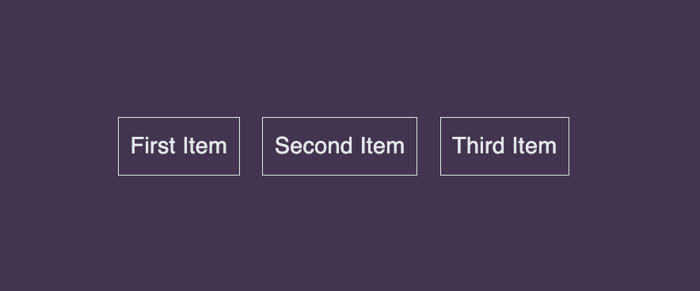
The direction property is central to MUI Stack, allowing you to set up a horizontal or vertical arrangement with ease. By default, Stack arranges its children in a vertical column, which is perfect for stacking elements top-to-bottom. For a horizontal layout, switch the direction to "row".
Here's an example:
import React from 'react';
import Stack from '@mui/material/Stack';
import Typography from '@mui/material/Typography';

function App() {
  return (
    <Stack direction="row" spacing={2}>
      <Typography variant="body1">First Item</Typography>
      <Typography variant="body1">Second Item</Typography>
      <Typography variant="body1">Third Item</Typography>
    </Stack>
  );
}

export default App;
In this code, direction="row" arranges items side by side horizontally, with spacing between each. This setup is helpful for creating menu bars, item lists, or any elements you want displayed in a row format. 
With this foundation, MUI Stack is ready to simplify your layout-building experience. Stay tuned as we dive deeper into configuration, spacing, and responsive layouts.
Configuring Spacing and Responsiveness
Effective spacing is key to creating visually appealing layouts, and MUI Stack makes it easy to adjust spacing between elements. With the spacing prop, you can define consistent gaps between child elements, either as a fixed value or responsive to screen size.
Spacing
To set a fixed spacing, simply use the spacing prop with a numeric value. For instance, spacing={2} will add a uniform gap between all children:
<Stack direction="row" spacing={2}>
  <Typography variant="body1">Item 1</Typography>
  <Typography variant="body1">Item 2</Typography>
  <Typography variant="body1">Item 3</Typography>
</Stack>
Here, each item in the Stack has a fixed gap between them, creating an evenly spaced, clean layout.
Responsive Spacing
MUI Stack also allows for responsive spacing by passing an object to the spacing prop. This enables different spacing values based on screen size breakpoints (e.g., xs, sm, md):
<Stack direction="row" spacing={{ xs: 1, sm: 2, md: 3 }}>
  <Typography variant="body1">Item 1</Typography>
  <Typography variant="body1">Item 2</Typography>
  <Typography variant="body1">Item 3</Typography>
</Stack>
In this example, the spacing will be narrower on smaller screens and wider on larger screens, automatically adjusting for optimal readability.

Responsive Direction Control
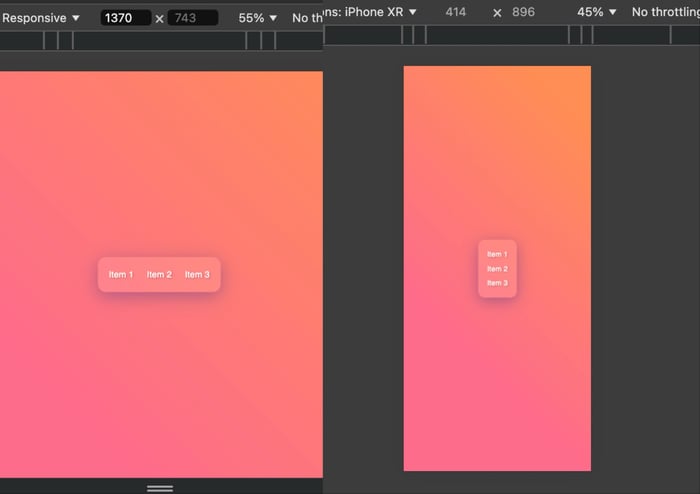
Another useful feature is Stack’s ability to adjust direction responsively, helping your layout adapt to various screen sizes. You can specify different directions for different breakpoints by setting direction={{ xs: "column", sm: "row" }}:
<Stack direction={{ xs: "column", sm: "row" }} spacing={2}>
  <Typography variant="body1">Item 1</Typography>
  <Typography variant="body1">Item 2</Typography>
  <Typography variant="body1">Item 3</Typography>
</Stack>
In this setup, items are arranged in a column on extra-small screens (e.g., phones) and switch to a row layout on small screens (e.g., tablets) and larger.

Enhanced Layout Customization
MUI Stack provides several customization options for building more complex, polished layouts. Let’s explore how to use dividers and alignment settings to refine your layout further.
Adding Dividers
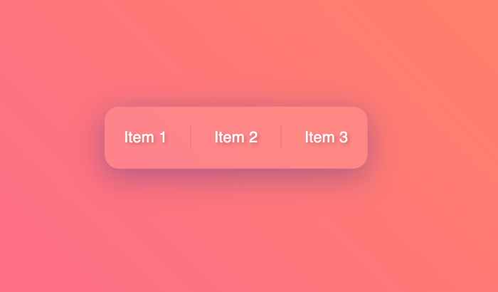
The divider prop allows you to insert a visual divider between Stack items. This is particularly useful for clearly separating elements in lists, navigation menus, or groups of buttons.
import Divider from '@mui/material/Divider';

<Stack direction="row" divider={<Divider orientation="vertical" flexItem />} spacing={2}>
  <Typography variant="body1">Item 1</Typography>
  <Typography variant="body1">Item 2</Typography>
  <Typography variant="body1">Item 3</Typography>
</Stack>
In this example, a vertical divider is placed between each item in the row layout, enhancing readability and structure. You can also set the orientation to horizontal if the Stack direction is set to column.

Justification and Alignment
To position Stack items precisely, MUI Stack supports justifyContent and alignItems props, which control alignment along the main and cross axes, respectively:
- justifyContent: Aligns items along the main axis (horizontal if
direction="row"; vertical ifdirection="column"). - alignItems: Aligns items along the cross axis (vertical if
direction="row"; horizontal ifdirection="column").
Example:
<Stack
  direction="row"
  spacing={2}
  justifyContent="center"
  alignItems="center"
>
  <Typography variant="body1">Item 1</Typography>
  <Typography variant="body1">Item 2</Typography>
  <Typography variant="body1">Item 3</Typography>
</Stack>
In this setup, justifyContent="center" centers items along the main axis, while alignItems="center" centers them along the cross axis, resulting in a neatly centered layout. This flexibility allows you to create layouts that adapt to different screen sizes and maintain visual harmony.
Using System Props for Custom Styling
MUI Stack supports system props, which are convenient style properties that allow you to apply margins, padding, and other layout-related CSS directly on the component. System props eliminate the need for additional CSS files, enabling you to manage styles within your components, keeping your code organized and efficient.
For instance, to add padding around the Stack or margin between it and other elements, you can directly set the p (padding) or m (margin) props:
<Stack
  direction="row"
  spacing={2}
  p={2} // Adds padding inside the Stack
  m={3} // Adds margin outside the Stack
  sx={{ bgcolor: 'grey.100' }} // Optional background color for emphasis
>
  <Typography variant="body1">Item 1</Typography>
  <Typography variant="body1">Item 2</Typography>
  <Typography variant="body1">Item 3</Typography>
</Stack>
In this example, p={2} adds internal padding around the Stack, while m={3} creates an external margin between the Stack and other elements on the page. You can use these shorthand system props for various adjustments, including margin (m), padding (p), width (width), and height (height), offering significant layout control without extra CSS code.
Conclusion
MUI Stack is a highly flexible and efficient component for managing one-dimensional layouts in React. By simplifying the alignment, spacing, and responsiveness of elements, Stack reduces the need for custom CSS and accelerates the development process.
The ability to control layout direction, spacing, and styling through system props makes MUI Stack a powerful addition to any project that values clean and maintainable code. Whether you're building simple navigation bars or complex responsive layouts, MUI Stack offers a streamlined way to structure your UI.
Feel free to explore additional MUI documentation to unlock even more customization options, such as advanced system props, responsive design enhancements, and integrating Stack with other MUI components for comprehensive layout solutions.
Related articles

Development using CodeParrot AI


