

Figma for developers: Figma Components
Introduction
In our last post, Figma for Developers: Figma Styles, Typography, and Variables, we explored how to create reusable design elements that ensure consistency across projects. By defining and applying styles and variables, developers can streamline the design-to-code process and ensure uniformity throughout their work.
Building on that foundation, this post focuses on Figma Components, another powerful feature in Figma that simplifies design even further. Components are reusable elements—like buttons, icons, or cards—that make it easier to maintain consistency and scalability across multiple screens or pages. For developers, using components is an essential way to avoid repetitive work, ensure design consistency, and make updates across projects easier and more efficient. Let’s dive into how components work and how they can enhance your workflow in Figma for developers.
What Are Figma Components?
Figma components are reusable design elements that function like code snippets or modules in development. These elements, whether buttons, icons, or entire sections of a layout, can be created once and reused across different parts of your project. When you need to make updates, you simply modify the master component, and every instance of that component reflects the change. This makes it a powerful tool for developers and designers alike, ensuring that the design is scalable, efficient, and easy to manage.
Why They Matter
- Ensure Consistency: Components help maintain a unified design throughout a project. By using the same element across multiple screens or pages, you ensure that the design looks cohesive.
- Simplify Updates: Updating a component in one place will automatically update all instances of that component, saving significant time and effort when making design adjustments.
- Reduce Repetitive Work: Instead of recreating the same elements for different parts of your project, components let you reuse the same design, streamlining the workflow.
- Scalability: As the project grows, components make it easier to adapt and scale your design system, ensuring everything remains organized and efficient.
- Enhance Development Efficiency: Components help bridge the gap between design and development by ensuring the design-to-code translation is smooth, reducing the risk of inconsistencies or errors.
By using components, Figma for developers allows you to maintain design integrity, speed up the workflow, and make the project easier to manage and scale.
Creating a Component in Figma
Creating components in Figma is a straightforward process and a crucial step in building reusable design elements. For developers, this is similar to turning a UI element into a reusable code module.
How to Create a Component
- Select the Element: First, choose the element you want to convert into a component. This could be anything from a button, icon, or even an entire section of a layout.
- Right-Click and Convert: Once selected, right-click the element and choose “Create Component” from the context menu. Alternatively, use the shortcut
Ctrl + Alt + K(Windows) orCmd + Option + K(Mac).
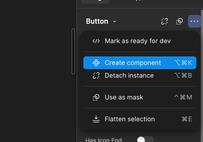
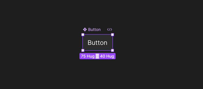
- Component Creation: You’ll notice a purple outline around the element once it’s converted into a component, signifying that it is now a master component that can be reused across your project.
Practical Use
Let’s say you’ve designed a button that you’ll need across multiple screens of your application. By converting it into a component, you can easily reuse this button throughout the project. Instead of manually recreating the button each time, you can simply duplicate the component wherever needed. If you later decide to change the button’s style—such as color, size, or typography—you only need to update the master component, and every instance of that button will automatically update across your project.
By using components in Figma for developers, you ensure consistency, reduce redundancy, and save time, especially in larger projects where repeated design elements are common.
Working with Component Variants
Definition of Variants
Variants in Figma allow you to create multiple states for a single component, making your design more dynamic and flexible. For developers, this is like handling different states in a UI element—such as hover, active, and disabled states for a button—without creating separate components for each state. Instead, you bundle these states within one master component, making it easy to switch between them as needed.
How to Create Variants
Creating variants is simple and adds another layer of flexibility to your components:
- Select the Component: First, select the component you want to add variants to, like a button.
- Open the Variants Panel: In the right-hand panel, you’ll find an option to create variants. Click “Add Variant” to start creating different states for your component.
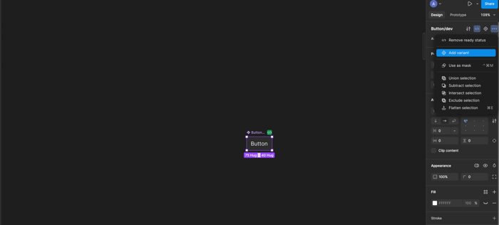
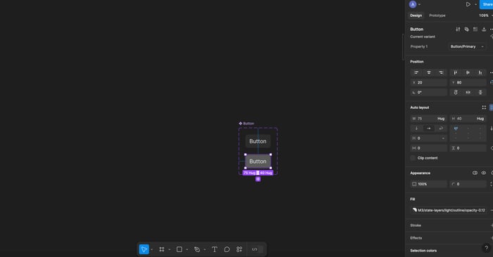
- Create Different Versions: You can now create multiple versions of the component (e.g., a normal button, a hover state, and a disabled state). Customize each version by changing properties such as color, border, or shadow to match the different states.
- Naming and Organization: You can name these variants (e.g., “Default,” “Hover,” “Disabled”) for easy identification and better organization.
Once you’ve added variants, Figma will automatically group them, allowing you to toggle between different states when working with instances of the component.
Practical Example: Button with Normal, Hover, and Disabled States
Let’s walk through an example. Imagine you’re designing a button that requires three states: Normal, Hover, and Disabled.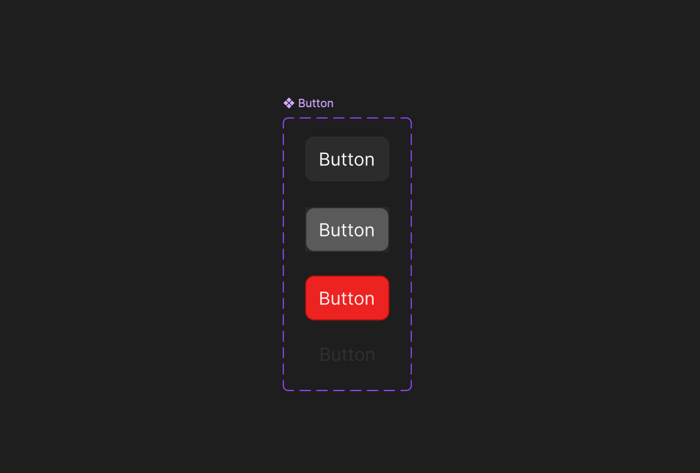
- Step 1: Create your Normal button and convert it into a component (as explained above).
- Step 2: Select the button component and add a variant for the hover state. Change the button’s color to indicate a hover effect.
- Step 3: Add another variant for the Disabled state, where you can modify the button’s opacity or change its color to a muted tone.
- Step 4: You now have a button component with three variants: Normal, Hover, and Disabled. When you use the button throughout your project, you can quickly switch between these states depending on the UI context.
By using variants in Figma for developers, you can manage complex design requirements, like interactive elements, with ease. This approach ensures that all button states remain consistent across your project, and it’s easy to update multiple states simultaneously.
Updating Components and Overriding Instances
In Figma for developers, one of the most useful features is the ability to make global updates to components. When you change something in the master component—like the color, size, or font—those changes are automatically reflected in all instances of that component across the project. This ensures consistency and saves time, especially in large projects.
How to Update Components Globally:
- Select the Master Component: Find your master component in the assets panel or directly on the canvas.
- Make Changes: Modify the properties like color, size, or typography.
- Global Reflection: Watch as all instances of that component are updated automatically across your project.
However, if you need a particular instance to behave differently, you can apply instance overrides. For example, you might want to change the text or color of a specific button while keeping the overall design consistent with the master component.
How to Override Specific Instances:
- Select an Instance: Click on the instance of the component you want to modify.
- Override Specific Properties: Change text, color, or other properties without affecting the master component or other instances.
- Maintain Master Structure: The overridden instance will still follow updates made to the master, except for the overridden properties.
This balance between global updates and localized customization gives you the flexibility to adapt components as needed while maintaining consistency across the project.
Nesting Components for Complex Systems
In Figma, you can create more complex designs by nesting components within other components. This is particularly useful for multi-element designs like cards, which might include images, text blocks, and buttons. By nesting, each part of the design remains reusable and easily updatable.
How to Nest Components:
- Create Individual Components: Start by making separate components for each element (e.g., image, text, button).
- Combine into a Parent Component: Select all individual components and right-click to “Create Component” again, turning them into a single, nested component.
- Reuse and Modify: Now you can use this complex component across your project, updating each part as needed, while the nested structure stays intact.
Practical Example: Designing a Card with Nested Components
- Create Image Component: Design the image part of the card and convert it to a component.
- Create Text and Button Components: Similarly, create components for the text and button.
- Nest Components: Group them together to create a card component that can be reused. Now, any update to the button or text components will be reflected in all cards, keeping your design scalable.
By nesting components, you can manage complex design systems with ease, ensuring that updates to any part of the design ripple through all related elements while maintaining flexibility.
6. Keyboard Shortcuts for Components
Incorporating keyboard shortcuts while working with components in Figma for developers can drastically improve your efficiency. Here’s a list of essential shortcuts that will help streamline your workflow when creating and managing components:
Ctrl + Alt + K(Windows) /Cmd + Option + K(Mac) – Create a Component: Quickly convert any selected element into a reusable component, saving time on repetitive tasks.Shift + I– Insert a Component: Open the components panel instantly and drop in any existing component, speeding up the design process.Alt + Click– Detach Instance: If you need to customize a specific instance of a component without affecting the master, use this shortcut to detach it.Ctrl + D– Duplicate Component: Quickly duplicate a component and all its properties, great for layouts with repeating elements like buttons or cards.Ctrl + Alt + B– Make Component from Selection: Select multiple elements and create a single, nested component from them.Cmd + /(Mac) orCtrl + /(Windows) – Quick Search: Use this to quickly find and insert any component in your design file.
By mastering these shortcuts, you can drastically cut down on time spent searching for tools or performing repetitive actions, allowing you to focus on building a consistent and scalable design system. Shortcuts make it easy to handle large projects with lots of components and variants, keeping your workflow smooth and efficient.
Conclusion
In this post, we covered the fundamentals of using components in Figma to create reusable, scalable design systems in Figma for developers . From creating components and variants to managing updates and nesting complex elements, components are an essential tool for developers looking to streamline their workflow. By leveraging components, you can ensure consistency across your designs, reduce redundant tasks, and make global changes with ease.
Now that you’re familiar with these concepts, take some time to practice Figma for developers creating components and experimenting with variants. You’ll quickly see how they can simplify the design-to-code process, especially in larger projects.
Related articles

Development using CodeParrot AI


