

 07 Oct 2024
 14 minute read
Figma for developers: Figma Basics
For developers, working with design teams often means dealing with a tricky handoff process. This is where Figma for developers comes in, bridging the gap between design and code. Figma allows developers to collaborate in real-time, view and inspect designs, and export assets—all without waiting for static design files.
Now there comes a Question, Why Developers Should Care About Figma ? Figma for developers offers the ability to inspect every design detail, from spacing to color codes, making the transition from design to code seamless. Its real-time collaboration lets you work alongside designers, provide feedback early, and avoid delays during handoff. With Figma, the entire workflow becomes more integrated, helping to reduce miscommunication and speed up development.
Figma enables developers to understand and interact with design logic. You can experiment with layout grids, constraints, and responsive behaviors to ensure designs translate smoothly into code. Additionally, exporting assets like images and icons is simple and efficient, streamlining the design-to-code process.
In this blog series, we’ll explore how Figma for developers helps with layouts, styles, typography, and reusable components. By the end, you’ll understand how Figma can improve your workflow and enhance collaboration between design and development. Let’s dive into the basics and get started!
Getting Started with Figma
Creating an Account and Setting Up the Workspace
To start using Figma, the first step is to create an account. Head over to Figma’s website and sign up using your email or Google account. Once you're logged in, you’ll be greeted by the Figma dashboard, which serves as the central hub for all your projects.
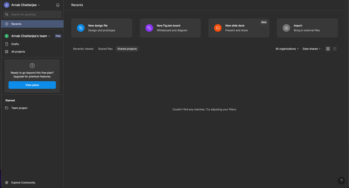 Figma Dashboard
From here, you can choose the right workspace based on your needs. If you're working alone or on personal projects, a Personal Workspace is sufficient. However, if you’re part of a team, you can set up a Team Workspace that allows for collaborative access, where multiple users can edit designs simultaneously and provide feedback in real time.
Figma’s Core Features for Developers
Figma’s core features make it an indispensable tool for developers. The real-time collaboration feature allows you to work alongside designers, viewing their updates live as they make changes. This reduces delays in communication and ensures that you’re always working with the latest design.
Another essential feature for developers is asset exporting. Instead of asking designers for static files, you can export icons, images, or logos directly from the design file, choosing formats such as SVG or PNG depending on your project’s needs.
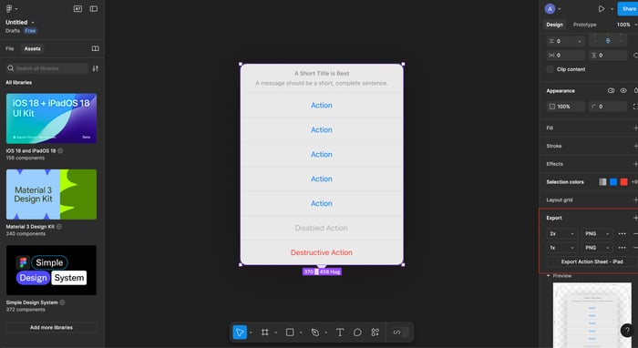 Componenet Export
By setting up your workspace and familiarizing yourself with these features, you’re ready to integrate Figma into your development process efficiently!
Navigating Figma’s Interface Efficiently
Understanding Figma’s interface is key to working smoothly alongside designers. Here’s a breakdown of the main sections developers should be familiar with:
Overview of Figma’s Interface
Toolbar: The toolbar at the top contains tools for adding shapes, frames, and text, along with the selection and move tools. Developers often use these to view different design components or to make small adjustments.
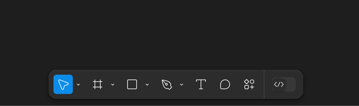 Tool Bar
Left Panel (Layers, Pages, and Assets): This panel organizes all design elements in layers and pages. You can use it to inspect how elements are grouped or nested, making it easier to understand the design hierarchy. For developers, this is similar to managing elements in a DOM tree.
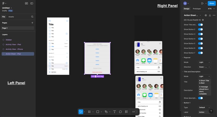 Left and Right Panel
Right Panel (Properties and Components): The right panel is where you can see and adjust the properties of any selected element. This is helpful for developers to inspect specific attributes, such as dimensions, colors, and positioning. If the design includes reusable components, you can also view and modify component settings here.
Personalizing the Interface for Better Workflow
Figma for developers allows some level of interface customization, enabling you to rearrange the panels to suit your workflow. For example, if you frequently inspect layers or properties, you can prioritize those panels. While the customization is limited compared to a full-fledged code editor, small adjustments can make the interface feel more familiar and comfortable to use.
Shortcuts and Quick Actions
Figma includes several handy shortcuts that can speed up your workflow, especially for developers inspecting or exporting designs:
- Command/Ctrl + / (Quick Actions): This opens the Quick Actions palette, allowing you to search for tools and commands instantly.
- V: Select tool, which lets you quickly choose and move elements.
- Shift + R: Toggle rulers on and off to measure distances between design elements.
- Command/Ctrl + E: Export selected layers or assets.
- Alt/Option + Drag: Duplicate any selected object.
Using these shortcuts will make navigating designs and inspecting assets much faster, allowing you to stay focused on development without getting bogged down in design details.
Understanding Frames, Sections, and Groups
In Figma for developers , frames, sections, and groups help structure and organize designs, much like how containers, divs, and sections function in HTML/CSS. As a developer, understanding these concepts will make it easier for you to translate designs into code.
What Frames Mean for Developers
Frames in Figma are the building blocks of design layouts, and for developers, they can be thought of as containers in HTML/CSS. A frame can contain elements like text, buttons, or images, and it allows you to define layout properties, much like a div with flexbox or grid properties in CSS. Frames can be nested within other frames, creating a structure that is easily translated to a frontend layout.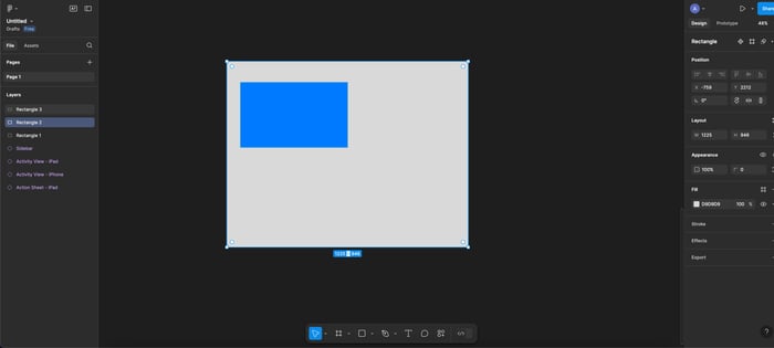
For example, you could create a frame for the main content of a website, which contains smaller frames for headers, navigation, and footers. These frames act as containers, ensuring all design elements are neatly grouped and can be manipulated as a single unit.
Sections vs. Groups
Groups are a simpler way to organize elements in Figma. They are like non-structured clusters of elements that don’t affect layout rules. For example, if you group a set of buttons together, you can move them around as a unit, but they won’t behave like a responsive layout. To Group your elements select elements and click ⌘G (Ctrl-G on Windows) 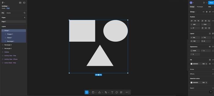
Sections, on the other hand, are used to organize design elements at a higher level, similar to how sections in HTML organize different parts of a webpage. Sections allow you to keep related frames and elements together in a more organized manner, especially in large, multi-page designs. This can be incredibly useful when managing complex projects that have multiple screens or design areas, making it easier to jump between sections or organize the design hierarchy.
- When to Use Frames: Use frames when you need to control layout properties, like responsiveness, alignment, and constraints.
- When to Use Groups: Use groups for simpler clustering of design elements that don’t require layout rules.
- When to Use Sections: Use sections to organize large groups of frames or to keep the workspace tidy and well-structured in complex designs.
Creating a Frame for a Website Header
Let’s say you’re building a website header in Figma. You’d create a frame to act as the container for the header, similar to how you’d use a <header> tag in HTML. Inside this frame, you’d place elements like the logo, navigation links, and a call-to-action button.
- Step 1: Create a new frame in Figma for the header.
- Step 2: Inside the frame, add a logo, a navigation bar, and a button.
- Step 3: Use constraints within the frame to ensure that the header resizes responsively, much like using CSS for a flexible layout.
By understanding how to use frames, sections, and groups in Figma, you can organize design elements more effectively, making the handoff between design and development far smoother.
Aligning and Distributing Objects
Organizing elements within a design is essential for part of Figma for developers when translating designs into pixel-perfect layouts. Figma’s alignment and distribution tools streamline this process, making it easy to position elements accurately—similar to using CSS grid or flexbox in web development.
Automated Alignment Tools
Figma’s smart guides and snapping features automatically help align objects in relation to one another, saving time and ensuring consistency. As you move elements around the canvas, Figma’s guides appear to suggest alignments and ensure that spacing is equal, much like how CSS grid auto-aligns items.
For example, if you’re aligning several buttons in a row, Figma will guide you to keep them evenly spaced and perfectly aligned without needing manual adjustments. These tools significantly reduce the margin for error and make the alignment process intuitive.
Manual Adjustments
For more precision, Figma for developers allows you to input numerical values to control positioning and size. Developers often need to translate these exact values into CSS, so being able to set pixel-perfect dimensions in Figma helps ensure designs match what will ultimately be built. You can manually adjust the X and Y coordinates or change the width and height of an element down to the pixel.
This method is useful when you need exact spacing between elements, such as defining margins or paddings between different design components. By inputting values directly into Figma’s properties panel, you can ensure everything is precisely where it needs to be.
Using Constraints for Responsive Behavior
One of the standout features for developers in Figma is constraints. Constraints allow you to control how objects behave when the design’s frame is resized—similar to responsive behavior in web development.
For example, you can set a button to always stay centered within its frame or anchor a logo to the top-left corner. By experimenting with these constraints directly in the design phase, developers can get a feel for how elements will behave in different screen sizes before even writing a single line of code. This can also help you communicate responsive needs to designers or even adjust them yourself.
By using alignment tools and experimenting with constraints in Figma, you’ll gain a deeper understanding of how to create responsive and well-organized layouts, just as you would with CSS in web development. This process makes the eventual coding phase smoother, as you’ve already accounted for layout behavior within the design itself.
Exporting Assets for Development
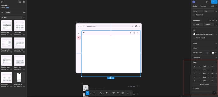
Exporting design assets is an important step for developers to integrate Figma designs into a web project. Figma simplifies this process by offering flexible export options for images, icons, and vectors, all while ensuring the exported files are optimized for web performance.
Exporting Basics for Developers
When it’s time to export assets from Figma, developers can choose from multiple formats, including SVG, PNG, JPG, and more. Here’s how to determine which format to use:
- SVG: Ideal for scalable icons and vector graphics, as it maintains quality at any resolution. SVGs are lightweight and perfect for responsive websites.
- PNG: Best for images requiring transparency or higher quality visuals, like logos.
- JPG: Suitable for photos or images that don’t require transparency. While JPGs are usually more compressed, they may slightly reduce visual quality, so use them for larger image files where load times are critical.
By selecting the right format, you ensure that assets load quickly and maintain visual quality, balancing aesthetics with performance.
Asset Optimization
Figma helps developers optimize assets during the export process. You can specify export settings to reduce file sizes, minimizing the need for external compression tools later on. This can significantly improve page load times, which is crucial for web performance. For instance, when exporting PNGs or JPGs, Figma allows you to adjust the quality and resolution to better fit your needs, ensuring that assets are optimized for the web right from the start.
Retina-Ready Assets with 2x/3x Exports
One of Figma’s unique features is the ability to export assets at 2x or 3x resolution, creating retina-ready images for high-density screens (e.g., MacBook Retina displays). This ensures that icons and graphics remain sharp, even on devices with higher pixel densities. For developers, this means fewer complaints about blurry images on high-end devices, and it integrates perfectly with responsive design strategies.
To create retina-ready assets, simply select the element you wish to export, choose the desired export format, and select 2x or 3x as the scale. Figma will automatically generate multiple versions of the asset, optimized for different screen resolutions.
Using Figma’s Inspector for Developers
What the Inspector Offers
Figma’s Inspector tool is a goldmine for developers. It allows you to extract all the key details needed for accurate implementation. With the Inspector, you can view and copy values such as:
- Dimensions: Exact width and height of elements, crucial for setting up consistent layouts in code.
- Margins and Padding: Inspect the spacing between elements to match designs precisely in your CSS.
- CSS Properties: Figma provides ready-to-use CSS snippets for elements, including font styles, colors, and box-shadow properties. This makes it easy to translate design specifications into CSS without guessing or asking for more details.
Developer-Focused Tools
Figma’s Inspector also lets developers access specific values that are often needed for frontend work:
- Color Codes: Direct access to HEX, RGB, or HSL values, which can be copied and pasted directly into CSS.
- Font Styles: Get font families, sizes, weights, and line heights to ensure typography matches the design.
- Spacing and Alignment: Figma for developers offers tools to measure pixel-perfect distances between elements, helping you replicate exact spacing in the frontend.
These features streamline the process of turning design elements into code, ensuring everything remains consistent across the design and implementation.
Figma’s Developer Mode
Figma’s Developer Mode enhances handoff by providing even deeper access to code. In this mode, developers can not only extract CSS but also HTML, Swift, or Flutter code snippets, making it particularly useful for multi-platform projects. This mode enables a more efficient handoff by reducing the time spent converting designs into workable code.
Collaborating in Figma as a Developer
Real-Time Collaboration
One of Figma’s standout features is its real-time collaboration. Developers can work alongside designers in the same Figma file, providing feedback, requesting changes, or asking for clarifications in real time. This eliminates the back-and-forth usually required over email or messaging platforms.
For example, while a designer is working on a UI component, you can immediately check the layout, make notes, and ensure the design is feasible from a development standpoint, all within the same workspace. Figma’s collaboration tools keep the workflow smooth, minimizing delays and misunderstandings.
Commenting and Reviewing
Figma’s commenting feature is extremely valuable for developers. You can leave feedback on specific parts of the design, ensuring the designer knows which areas might need adjustment for technical reasons. For instance, if a design element might not work well responsively, you can highlight it and leave a note. Comments are tied directly to the design, so there’s no confusion about what needs to be fixed or addressed.
Version Control
Figma for developers offers version control, allowing developers to track design iterations and view older versions of the project if needed. This is useful when you need to revert to a previous design or see how the design evolved.Figma for developers also helps ensure that everyone is working on the latest version of the design, avoiding potential errors.
Conclusion
In this post, we’ve explored the basics of Figma for developers from a developer’s perspective, covering everything from navigating the interface to creating simple components. You’ve learned how to:
- Use Figma’s alignment tools for precise layouts.
- Work with frames and sections to organize design elements.
- Export assets and use the Inspector for detailed design properties.
- Build and visualize a button component, which can be easily translated into code.
In the next post, “Figma for Developers: Figma Layout,” we’ll dive deeper into advanced layout features such as auto-layout, grid systems, and constraints. These tools are essential for creating responsive designs that adapt to various screen sizes.
Now it’s your turn! Use what you’ve learned to create a simple button or another component in Figma. Experiment with alignment, constraints, and hover states to see how Figma for developers can help streamline your development process.
Related articles


Development using CodeParrot AI

