
 03 Aug 2024
 7 minute read
How to Build Efficient Design Systems in Figma with MUI Components
Table of Contents
- What is a Design System?
- Getting Started with Figma
- What is MUI?
- Integrating MUI Components in Figma
- Building Your Design System
- Designing with MUI Components
- Collaborating with Your Team
- Implementing Your Design System in Code
- Best Practices for Building a Design System
- Common Challenges and How to Overcome Them
- Conclusion
Building a robust and efficient design system is crucial for maintaining consistency and accelerating your design process. By combining the power of Figma with the pre-built components offered by MUI, you can streamline your workflow and create exceptional user experiences. This guide will walk you through the steps of integrating MUI components into your Figma design system, ensuring that your designs are not only visually appealing but also highly functional and maintainable.
What is a Design System?
A design system is a collection of reusable components, guided by clear standards, that can be assembled to build any number of applications. It serves as a single source of truth, ensuring consistency across design and development.
Benefits of a Design System
- Consistency: Ensures uniformity across all platforms.
- Efficiency: Speeds up the design and development process.
- Scalability: Makes it easier to maintain and scale your project.
Getting Started with Figma
Setting Up Figma
If you haven't already, sign up for a Figma account and download the desktop app for a smoother experience. Figma is available on both Mac and Windows, and it’s free for individual use.
Overview of Figma's Interface
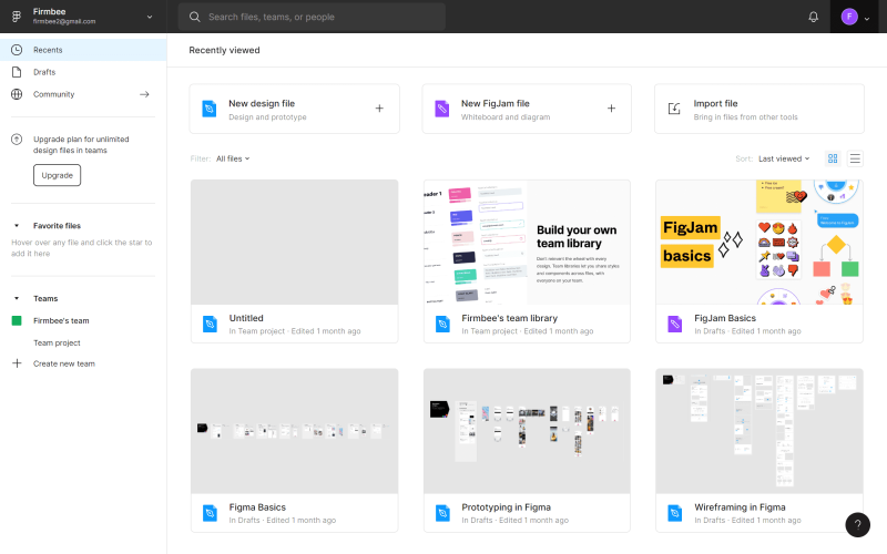
Source- FirmBee
Figma's interface is user-friendly. On the left sidebar, you'll find layers and pages. The center is your canvas and the right sidebar houses design properties. Familiarize yourself with these areas to get the most out of Figma.
Also Read, Turning UI Designs into HTML Code for Custom Websites
What is MUI?
MUI (formerly Material-UI) is a popular React component library that implements Google's Material Design. It offers a wide range of customizable components, making it an excellent choice for building consistent UIs.
Benefits of Using MUI Components
- Rich Component Library: A comprehensive set of components ready to use.
- Customization: Highly customizable to fit your design needs.
- Community Support: Large community and extensive documentation.
Integrating MUI Components in Figma
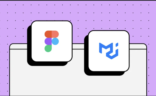
Source- UXpin
To start using MUI components in Figma, you'll need to install a plugin. Search for "MUI" in Figma's plugin directory and install it. This plugin allows you to drag and drop MUI components directly into your Figma designs.
Exploring MUI Components
Once installed, explore the various components available in the MUI library. You'll find everything from buttons and forms to complex layouts. Drag these components onto your canvas and start designing.
Building Your Design System
Create a new project in Figma and name it something like "Design System". This project will house all your components, styles, and guidelines.
Defining Your Design Tokens
Design tokens are the basic building blocks of your design system. They include colors, typography, spacing, and more. Define these tokens in Figma and use them consistently across your designs.
Creating Components
Use MUI components to create reusable design elements. Buttons, input fields, and navigation bars are good starting points. Customize these components to match your design tokens.
Organizing Your Components
Organize your components into logical groups. Use Figma’s "Components" and "Styles" panels to keep everything tidy. This organization will make it easier to find and update components later.
Also Read, Turning UI Designs into HTML Code for Custom Websites
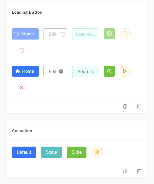
Designing with MUI Components

Examples of buttons layout with different components, Source- mui.com
To truly take your design game to the next level, use the power of MUI's versatile components. These components offer a comprehensive toolkit to create modern, responsive designs that resonate with users.
Creating Layouts
Use MUI’s grid system to create responsive layouts. Drag and drop grid components onto your canvas and arrange them to create complex layouts.
Applying Styles

Source- mui.com
Apply your design tokens to the MUI components. Change colors, typography, and spacing to match your design language.
Adding Interactions
Source- mui.com
Figma allows you to add interactions to your designs. Use these features to create interactive prototypes and test your designs before moving to development.
Collaborating with Your Team
Figma makes it easy to share your design system with your team. Use the "Share" button to invite team members to view or edit your project.
Collecting Feedback
Use Figma's commenting feature to collect feedback from your team. This feature allows for real-time collaboration and ensures everyone is on the same page.
Updating Your Design System
A design system is a living document. As your project evolves, update your components and design tokens to reflect the latest changes.
Implementing Your Design System in Code
Exporting Assets
Figma allows you to export your assets in various formats. Export your components as SVGs or PNGs and use them in your development projects.
Using MUI in Development
MUI integrates seamlessly with React. Install MUI in your project using npm or yarn and start using the components in your code. Refer to the MUI documentation for detailed instructions.
Maintaining Consistency
Use your design system as a reference to maintain consistency in your code. Ensure that your components and styles match those defined in your design system.
Also Read, Mastering Tailwind CSS: A Guide to Padding, Margin, and Borders
Best Practices for Building a Design System
Consistency is Key
Ensure that all components adhere to your design tokens and guidelines. Consistency is crucial for creating a cohesive user experience.
Document Everything
Document your components, design tokens, and guidelines. This documentation will serve as a reference for your team and ensure that everyone is on the same page.
Iterate and Improve
A design system is never truly complete. Continuously iterate and improve your system based on feedback and evolving project needs.
Common Challenges and How to Overcome Them
Keeping the Design System Up-to-Date
Regularly review and update your design system to reflect the latest changes in your project. Assign a dedicated person or team to maintain the system.
Ensuring Adoption
Encourage your team to use the design system by demonstrating its benefits. Provide training and resources to help them get started.
Managing Customizations
Allow for some flexibility in your design system to accommodate unique project requirements. Define clear guidelines for customizing components to maintain consistency.
Conclusion
Building a design system in Figma using MUI components is a game-changer for any project. It ensures consistency, improves efficiency, and facilitates collaboration between designers and developers. By following the steps outlined in this guide, you'll be well on your way to creating a robust design system that meets your project's needs.
CodeParrot is here to transform your design-to-code workflow. Seamlessly convert your Figma designs into production-ready code with ease. Whether you're using HTML, CSS, or React, CodeParrot has got you covered. Get started with CodeParrot today and elevate your coding game!
Read Next: All you need to know about Figma Dev Mode
Related articles


Development using CodeParrot AI

